
Mobile-first web design is a web design firstly designed for a small screen and then reaching the higher screen resolutions and screen sizes. Designing websites is difficult for mobile phones, thus it is important to deal with the mobile design first then designing for other devices. Mobile-first web design will help in laying out important objectives for bigger screen resolutions.
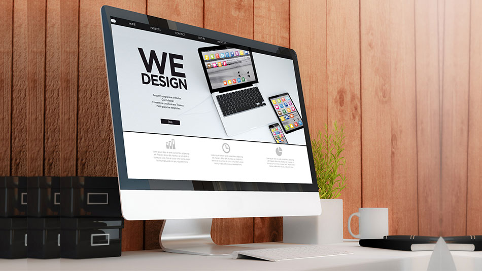
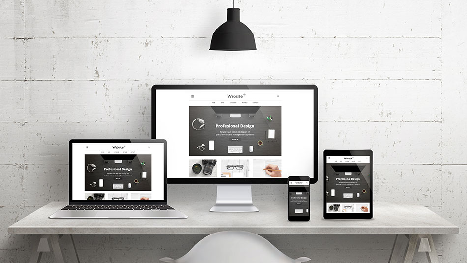
The easiest way to understand responsive web design and mobile-first web design is to see how the design changes itself according to the screen size. Mobile-first web design does not compromise on factors such as user experience, easy navigation, rich content, and more.
Globally, there are 4.92 billion mobile users and 3.77 billion internet users. The statistics will keep on increasing in the coming months and years. With the usability and flexibility provided by technology to users is proving to attract more and more audience towards itself.
To make your website more compliant to Google’s guidelines or a Google-friendly website, you must think of mobile-first web design. Moving one step ahead and having a mobile-first web design is beneficial in many ways.
Better design process
Mobile-first web design helps in designing a better website for all types of devices and users. The design process starts with a small screen device and goes up to the bigger device screen such as the desktop. This increase in the size depending website design enhances user experience (UX), user interface (UI), the content of the website, SEO, and more.
Responsive across all platforms
The main motive behind building a mobile-first web design is that it is responsive. The design should be able to adjust itself based on the screen size you are viewing the website on. The design you will see on a desktop screen will be similar to what you see on a small screen device such as a mobile phone or tablet.
Improved user experience
User experience can be delivered well with mobile-first web design. As the screen size of the mobile is compact, it means showing lesser content and giving fewer options to users to navigate around.
The design of a mobile-first website is such that there are lesser menu items compared to the one on your desktop website. This makes it easier for mobile users to browse your website with ease.
Clean website design will enhance the usage of the website and increase the user experience.
Graceful reduction of content
With mobile-first web design, you can get rid of less important content from your website and show the most important content first. This does not mean that rest of the content will not be displayed on the mobile-first web design, it will be shown but it will be shown on a priority basis.
Designing for impatient
Opening a desktop website can sometimes be difficult on a small mobile phone. It may be caused by slow internet speed, heavy website data, limited data plan, etc. With mobile-first web design, you combat all these factors and provide users a better, minimal, and lean website.
Conclusion
Mobile-first is happening right now and you must build a website that focuses on the best browsing experience for your user. If you want to run side by side with the real and virtual world, then you need to upgrade your website design to mobile-first web design. Developing a mobile-first website is beneficial for the long run rather than making a desktop website run slow on smaller and compact devices and screens. Mobile-first web design will increase your credibility among the audience for giving them a clean and less fussy website on their small-screen devices.