Web | Mobile | Branding
It’s been a long journey of working on various digital assets for the brand from marketing to sales to human resource functions. However, we’ve cherry picked one of the projects to talk about in this case study. This is about their brand website.
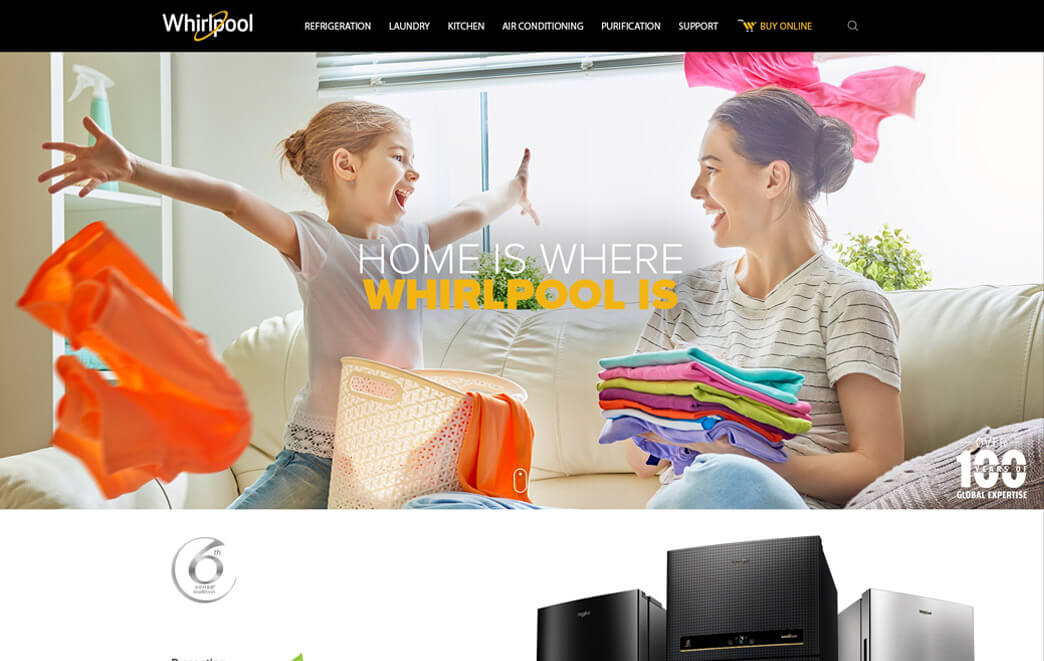
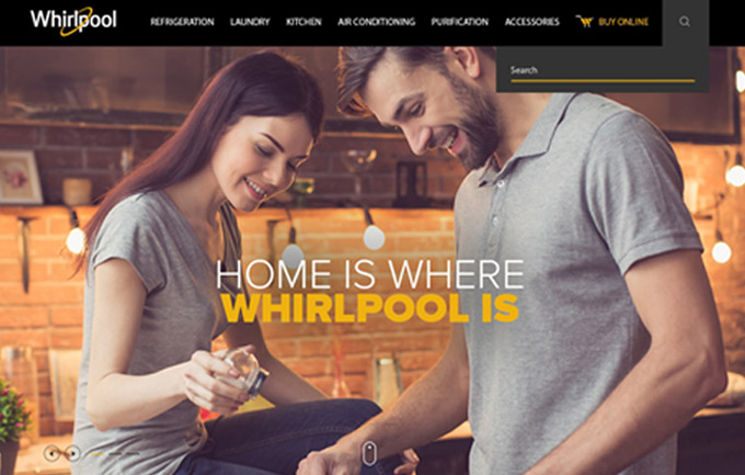
As the brand started to evolve and position itself as a premium white goods company, the challenge was to create this new positioning of the brand through design and user experience.
Whirlpool was mainly known for refrigerators and washing machines, but the product portfolio had expanded to cover almost all appliances needed in your home. The challenge was to change the consumer’s mindset.
The mandate given to us was clear, we need to create a new brand asset that sets the benchmark in the APAC region and comes out on top.
With more than 12 years of experience in building designs and experiences for consumer durable brands, we knew that the experience and knowledge we’ve gathered will have to play a major role and we got our senior UI and UX experts assigned on the job.
Research was an integral part of what we did. From the pool of data on consumers we curated groups with whom a targeted and structured research was undertaken and user personas were created. An iterative process was deployed to have UX and UI tested through audience groups and the feedback was reviewed and implemented to ensure that despite the experience we had, we knew what consumers expected.
Neurointeractive is part of Neuronimbus which is a digital solutions company with significant tech expertise and our UI and UX was cross referenced and validated across technology stack that was going to power the CMS and front end content delivery on the web. We are creative nerds who understand technology well.
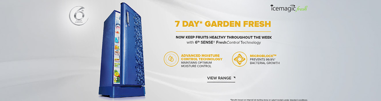
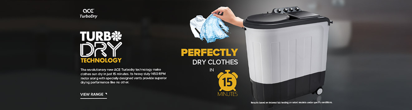
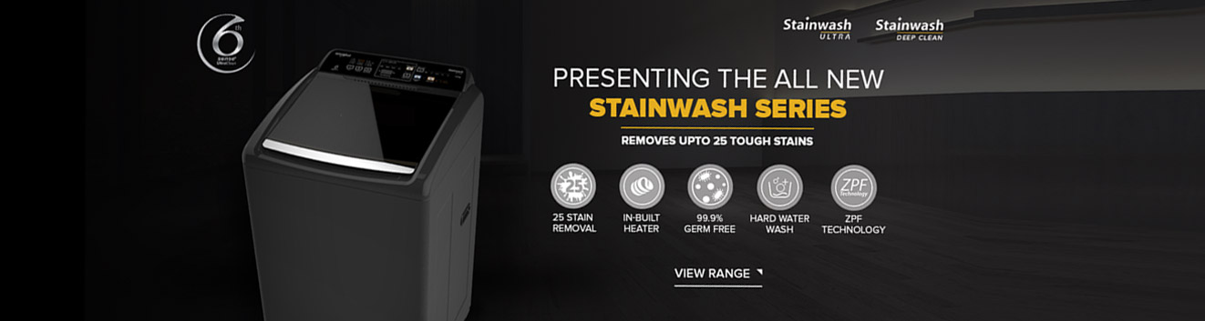
The brand deserved nothing but the very best and to elevate the brand’s impression and positioning we knew that there would be very little of “stock” in whatever we did. So from creating custom icons, vectors and graphics we ensured that each aspect of the user research and brand expectation was met.


What came out was recognised as the ‘gold standard’ for all other markets to follow in APAC.
Visit Whirlpool Web"We built a strong equation with Neuronimbus and they have worked with us seamlessly to fulfil our requirements"